The finest user experience
The finest user experience
For Even Finer Wines
For Even Finer Wines
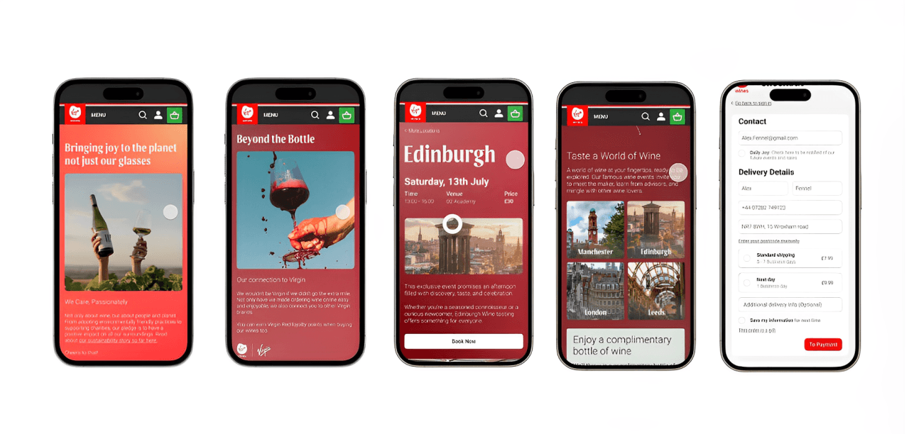
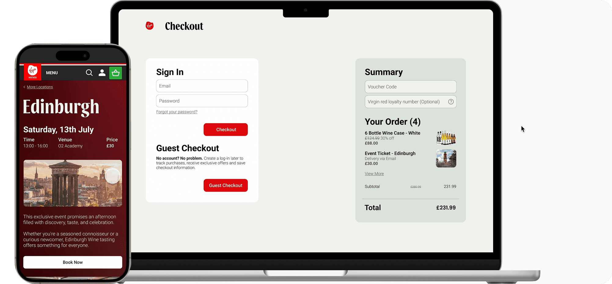
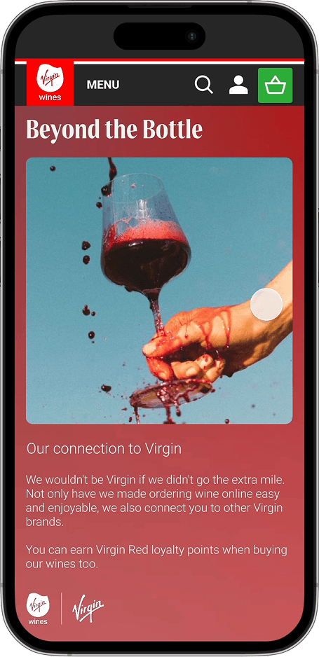
Virgin Wines faced challenges with specific aspects of their online customer journey. The project focused on optimising three key areas: the events section, checkout process, and about us page, aiming to enhance the user experience for both novice and experienced wine enthusiasts.
Virgin Wines faced challenges with specific aspects of their online customer journey. The project focused on optimising three key areas: the events section, checkout process, and about us page, aiming to enhance the user experience for both novice and experienced wine enthusiasts.

Improving the information architecture to allow for positive user journey.
Improving the information architecture to allow for positive user journey.

Organising components as CTA's that the user could engage with.
Organising components as CTA's that the user could engage with.

Linking the narrative of Virgin Wines throughout all concepts and ideas, via the brand guidelines.
Linking the narrative of Virgin Wines throughout all concepts and ideas, via the brand guidelines.
WHAT WE NEEDED TO ACHIEVE
And Why It Matters
Cross-platform Harmony
Reducing inconsistency between hierarchy, mobile and desktop interfaces, addressing the 94% of users who report frustration when website experiences differ between devices.
Streamlined User Flow
Simplification of aspects from process to CTAs, knowing each additional checkout step increases abandonment by 10%, while simplified processes show 35% higher conversion rates.
Compelling Brand Narrative
Telling a story that communicates Virgin Wines' unique selling point, leveraging how customers are 22x more likely to remember information presented as stories versus facts alone.
CONSISTENT BRAND VOICE
Utilising tone of voice within the site to ensure messaging resonates with Virgin Wines' personality as 65% of customers feel more emotionally connected to brands with consistent voice.
UTALISING WIREFRAMES TO EXPLORE CONTENT ORGANISATION
UTALISING WIREFRAMES TO EXPLORE CONTENT ORGANISATION
And what goals we had in mind
And what goals we had in mind

The live events section should be visually pleasing as well as easy for the user to navigate.
The live events section should be visually pleasing as well as easy for the user to navigate.

Organising components as CTA's that the user could engage with.
Organising components as CTA's that the user could engage with.

Linking the narrative of Virgin Wines throughout all concepts and ideas, via the brand guidelines.
Linking the narrative of Virgin Wines throughout all concepts and ideas, via the brand guidelines.
TESTING TO IMPROVE
The last stretch
PARTICIPANTS
We strategically recruited participants across three key segments: experienced wine enthusiasts, curious novices seeking guidance, and general consumers. This diverse sampling ensured our redesign would address the full spectrum of user needs and purchasing behaviors.
DESKTOP
Desktop testing employed sophisticated heat mapping and user journey tracking to measure engagement. Results showed a 42% reduction in checkout abandonment and 65% improvement in event discovery. Participants consistently rated the redesigned experience as "more cohesive" and "trustworthy" compared to the original site.
MOBILE
Our mobile usability testing revealed 78% of participants found the redesigned interface significantly more intuitive, with task completion rates improving by 35%. Navigation enhancements and streamlined visual elements received particularly positive feedback, addressing the growing segment of mobile shoppers.
Crafting our seamless website experience for Virgin Wines is about more than just transactions – it's about cultivating joy at every touchpoint.
Crafting our seamless website experience for Virgin Wines is about more than just transactions – it's about cultivating joy at every touchpoint.
By prioritising simplification, visual imagery, clear calls-to-action, and compelling narratives, we’ve created a digital journey that delights customers and drives business conversions.
By prioritising simplification, visual imagery, clear calls-to-action, and compelling narratives, we’ve created a digital journey that delights customers and drives business conversions.
Backed by research findings on visibility of system status, consistency and standards, and recognition over recall, our design is optimised for a top user experience.
Backed by research findings on visibility of system status, consistency and standards, and recognition over recall, our design is optimised for a top user experience.
Our goal was to showcase Virgin Wines' passion for good wine and translate the wine maker's joy from grape to glass to website clicks and mobile scrolls.
OTHER PROJECTS
Click to view
THE RED DEVILS
Click to view
THE RED DEVILS
Click to view
YAHOO SPACES
Click to view
YAHOO SPACES