
Through analysis of Manchester United's design systems, kit aesthetics, and digital presence, I uncovered their brand DNA. They balance tradition with innovation through texture layering and dimensional design, maintaining distinctive typography with NEXA headlines and Palatino body text. Their approach varies between rigid brand guidelines on official channels and creative flexibility on social media. These insights provided the blueprint for a design system that would resonate authentically with fans while offering fresh interactive dimensions.
Developing the site
and developing my skills along the way
The site opens with a custom animated logo sequence, breaking down Manchester United's iconic crest through scroll-triggered animations created in After Effects and implemented using Framer. As users explore further, they'll encounter responsive elements that react to their scrolling - from player cards that snap into view to interactive timelines that tell the club's story.
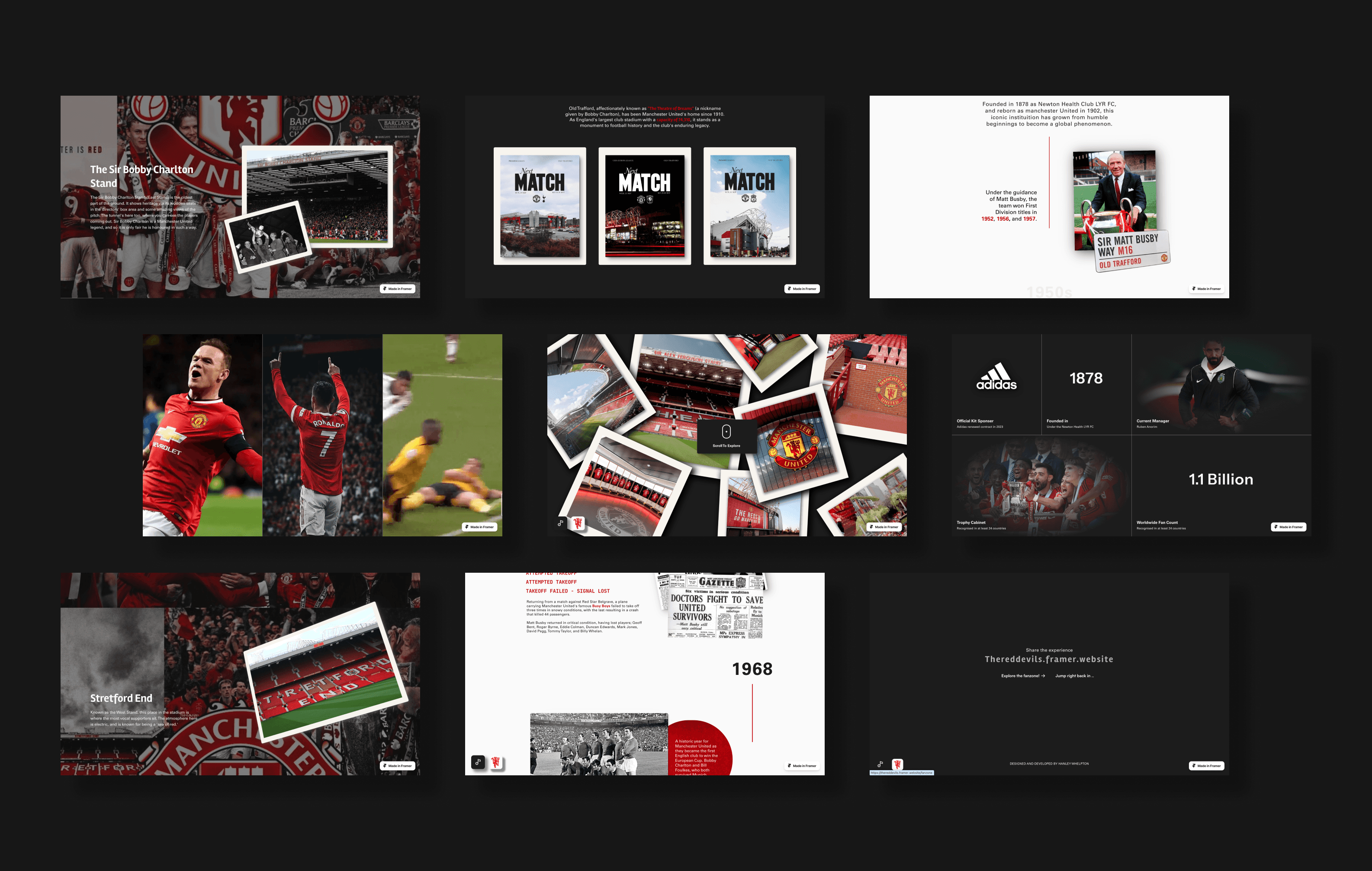
The Fan-zone section showcases interactive innovation through a draggable international player map, dynamic player profiles arranged in a bento-box layout, and hover-triggered celebration videos. Each interaction was meticulously developed using custom code overrides and viewport-based animations to ensure performance optimization while maintaining engaging, responsive feedback across devices.
This project showcases not just technical implementation of advanced web interactions, but a thoughtful approach to presenting club heritage in an engaging, modern format.
Due to a Framer update, this site is no longer fully responsive - but I am working on getting it back in shape!
OTHER PROJECTS